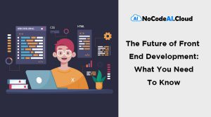
Defining Responsive Design
Responsive web design is a method of web development that creates dynamic changes to the appearance of a website, based on screen sizes for responsive design and the orientation of devices used to view it. This is one approach to the problem of designing for the multitude of devices available to customers, scaling from tiny phones to huge desktop monitors.
Mobile device usage to visit the internet is growing rapidly. The small size of these devices often requires content to be laid out differently on the screen.
Responsive web design is a functionality that allows for changes in a layout based on the size and capabilities of the device being used. This is done in order to better cater to the needs of the user. For example, those who are viewing content on a phone will see it displayed in a single column, while those using a tablet will see it displayed in two columns.
It is called responsive web design when you use CSS and HTML to resize, hide, shrink, enlarge, or move content so that it looks good on any screen.
As more and more people access the internet from mobile devices, it’s important to make sure that your website is optimized for all screen sizes. This is where responsive web design comes in.
Responsive web design is the process of using CSS and HTML to resize, hide, shrink, enlarge, or move content so that it looks good on any screen. By using responsive design, you can ensure that your website looks great no matter what device your users are on.
If you’re looking to create a responsive website, there are a few things you’ll need to keep in mind. In this article, we’ll give you a quick overview of responsive web design and some tips on how to get started.
RWD uses breakpoints to determine how the layout of a site will appear: one design is used above a breakpoint and another design is applied below that breakpoint.
There are three main steps to responsive web design:
1. Set the viewport
2. Create responsive layouts
3. Use media queries
The first step, setting the viewport, is relatively simple. You just need to add a meta tag to your HTML document that tells the browser what the width of the device is.
The second step, creating responsive layouts, is a bit more complicated. You need to create a layout that can be used on both mobile and desktop devices. One way to do this is to use a grid system. A grid system is a series of rows and columns that you can use to organizing your content.
The last step, using media queries, is the most difficult. Media queries are a CSS3 feature that allows you to change the style of your site based on the width of the device.
CSS Breakpoints
CSS breakpoints are used to adjust the styling of a website based on the width of the screen. This is useful because it allows you to tailor the look of your site to different devices, making sure that it looks good on all screen sizes.
Breakpoints in software development are intentional points of pauses or stoppage in a program, put in place for debugging purposes. At these points, your site content will respond in a way that provides the user with the best possible layout to consume the information. They are commonly referred to as pauses.
Although designers are typically told that, when first working with Responsive Designs, they should define breakpoints at exact device widths, a different approach—and perhaps one of the best practices of responsive web design—is to design for your smallest viewport first. As that view expands, there will come a point at which the design will no
There are a few different ways to use CSS breakpoints. One is to use media queries, which allows you to specify different styles for different screen sizes. Another is to use responsive design, which automatically adjusts the styling of your site based on the width of the screen.
Which approach you use will depend on your specific needs, but both methods can be effective ways to change the look of your site based on the size of the screen.
Mobile First
Mobile-first design is an excellent way to lay out content in a clear and logical manner on smaller screens. This approach helps identify the most important information on your site for customers.
The same HTML can be served to all devices by using CSS to adjust the appearance of the page to fit the various viewports. This eliminates the need to create and maintain separate codebases for different sized screens.
Basic guidelines and techniques for responsive web design
As the viewport size grows or shrinks, the page elements in responsive design will automatically rearrange themselves. This is done through a proportion-based grid, which is designed to adjust the content and design elements based on the device being used. While responsive design was originally created to provide equal access to information regardless of the device being used, it is also possible to hide certain elements – such as background images, secondary content, or supplementary navigation – on smaller screens. The decision to hide content or alter appearance should be based on user needs.
RWD has a number of potential benefits over developing separate sites for different device types. Developing a single codebase can be faster than developing 3 or 4 distinct sites, and easier to maintain over time, as one set of code and content needs to be updated rather than 3 or 4. RWD is also relatively “future-proof”, in that it can support new breakpoints as needed. If a 5-inch or 15-inch device becomes popular in the market, the code can support the new devices. RWD doesn’t tie design to a particular device.
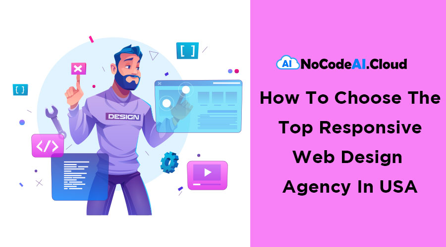
Responsive Web Design Agency In USA
NocodeAI Cloud is a leading Web Design Agency and development agency and full-service digital marketing company in the USA.
When selecting the best Web Design Agency for your business, consider design services that include the following: responsive design, audit, Market research, analysis, graphics, UI, UX, user testing and implementation, amongst many other features we provide to maximize the benefits of your website design. Discover what our professional team can bring to your website by contacting us online, or giving us a call to learn why we consider ourselves a top responsive web design agency in the USA, and how we can prove it.
NoCodeAI.Cloud is a US based company that is managed by a team of High level professionals with 60 plus years’ experience in Enterprise Data management, Cloud services, Artificial Intelligence, Machine Learning, Deep Learning, Business Process Development, Agile DevOps and the latest cutting edge technology in Robotic Process Automation (RPA) and HyperAutomation (HA).